by Gylian
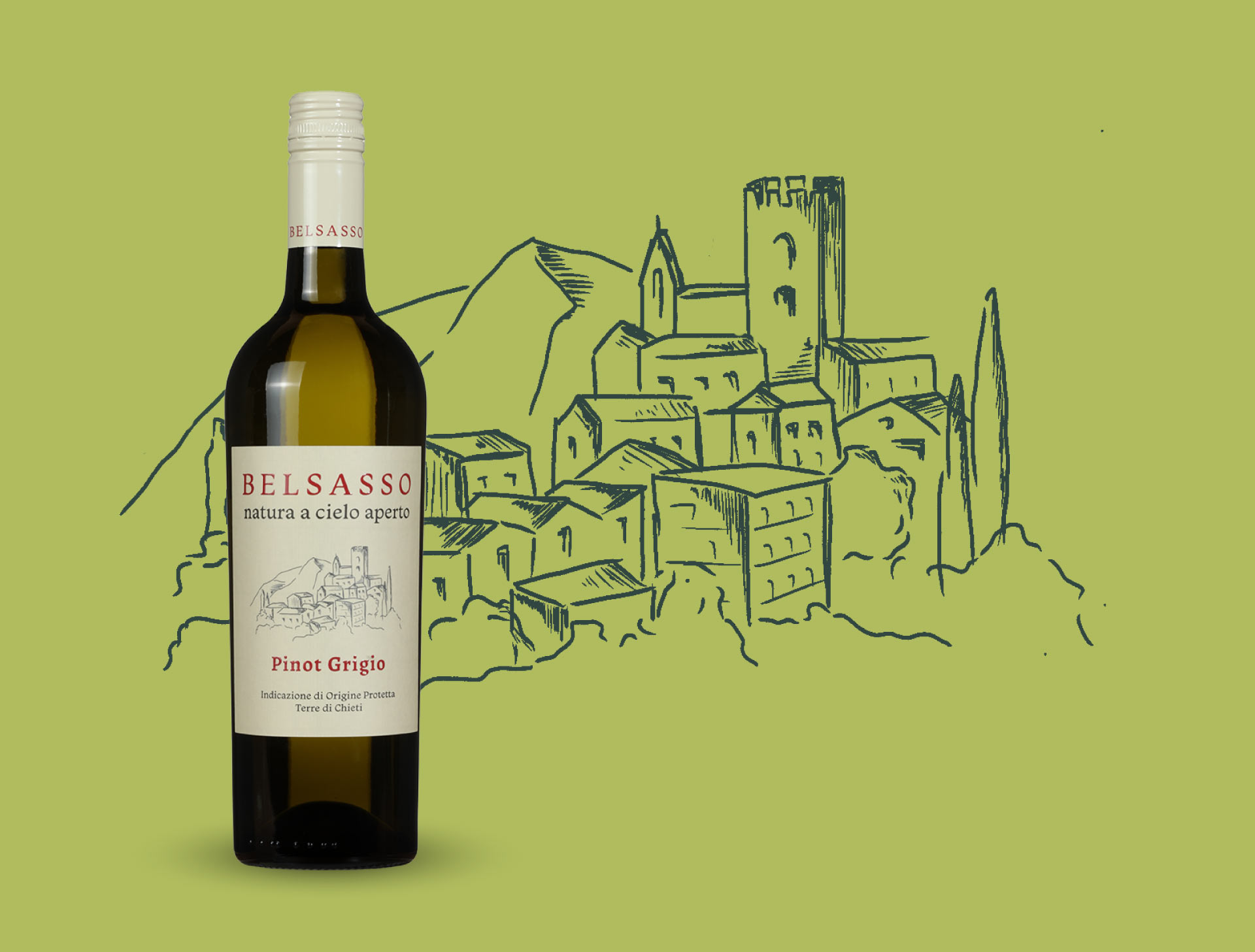
Belsasso means something like ‘beautiful rocks’, which stands for the beautiful landscape in Abruzzo, Italy. Together with Grapedistrict we decided this wine label needed to be a classic one, including a drawing of that landscape.
by Gylian

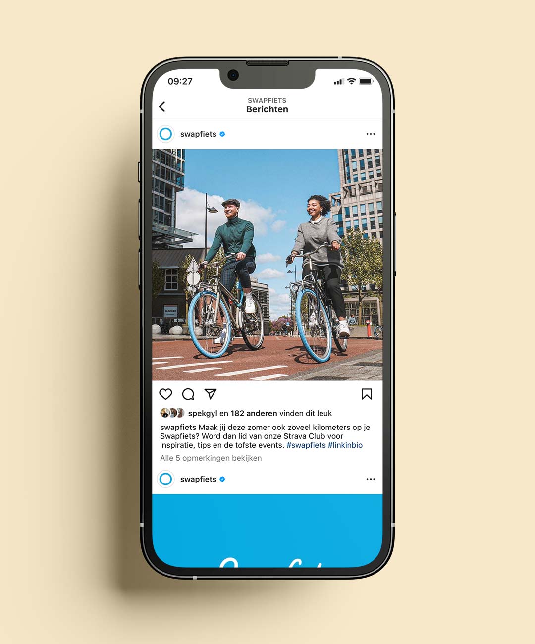
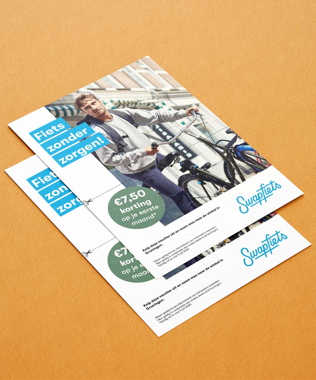
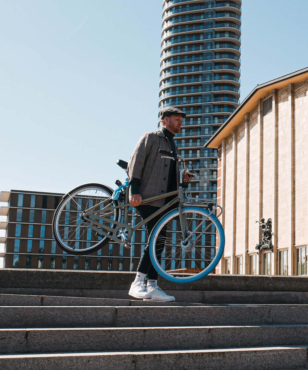
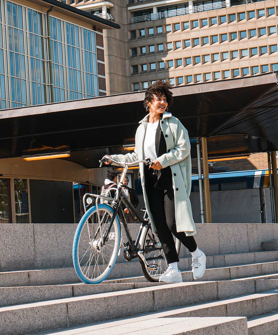
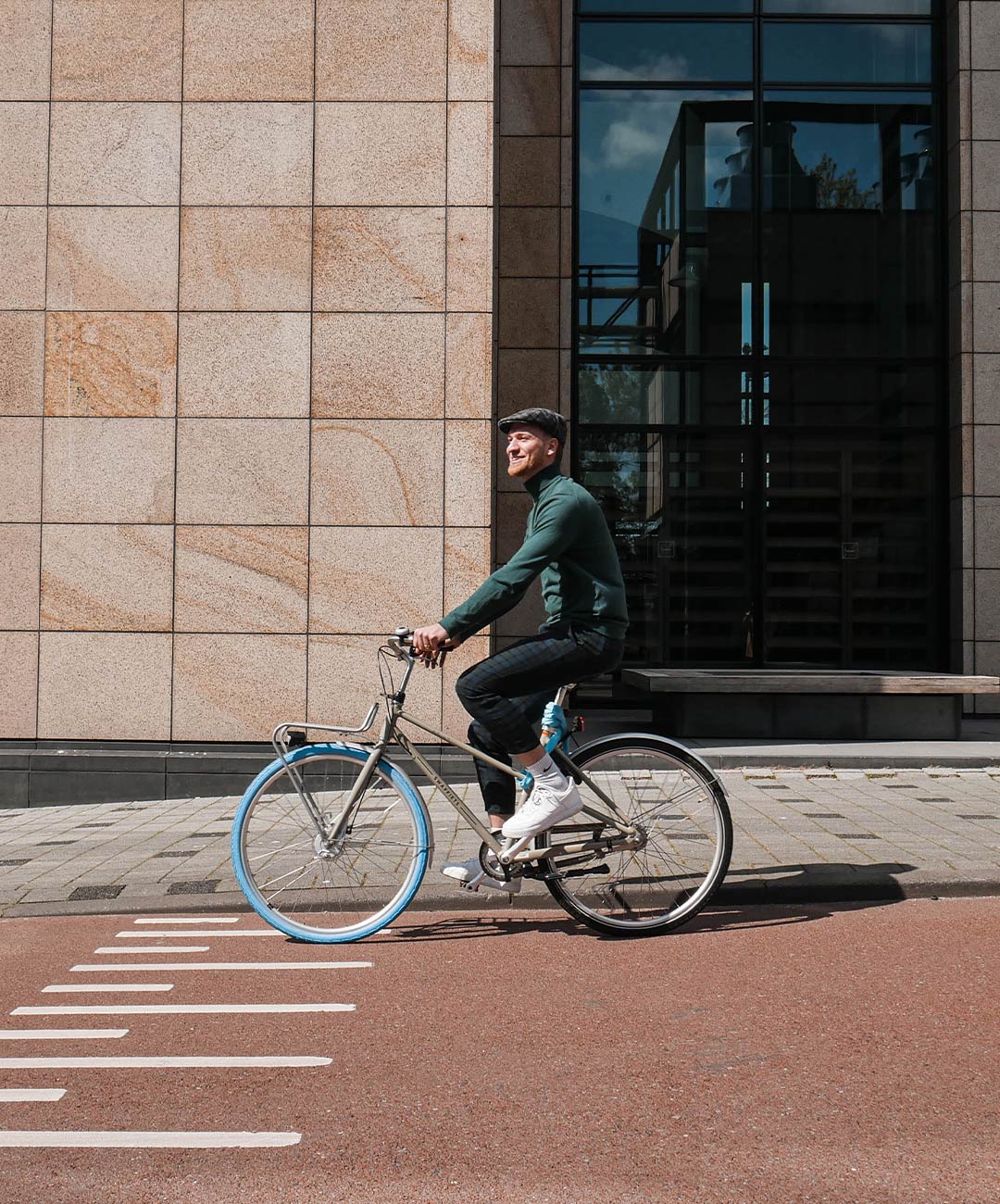
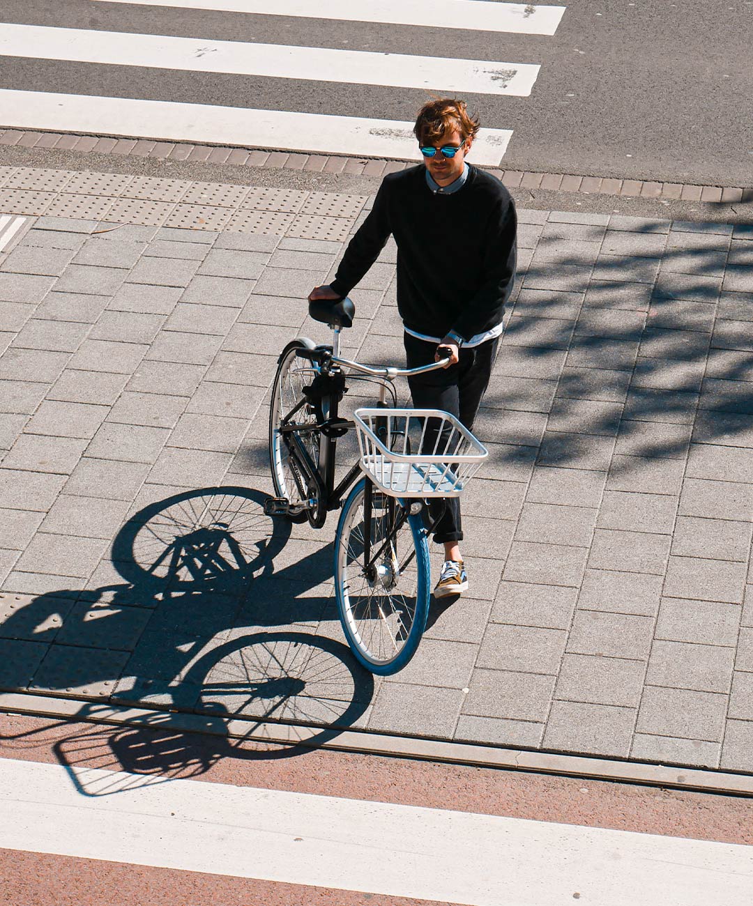
This fun shoot got even more fun when I got to choose my own friends as models. Look at them shine on those famous blue coloured Swapfiets tires.
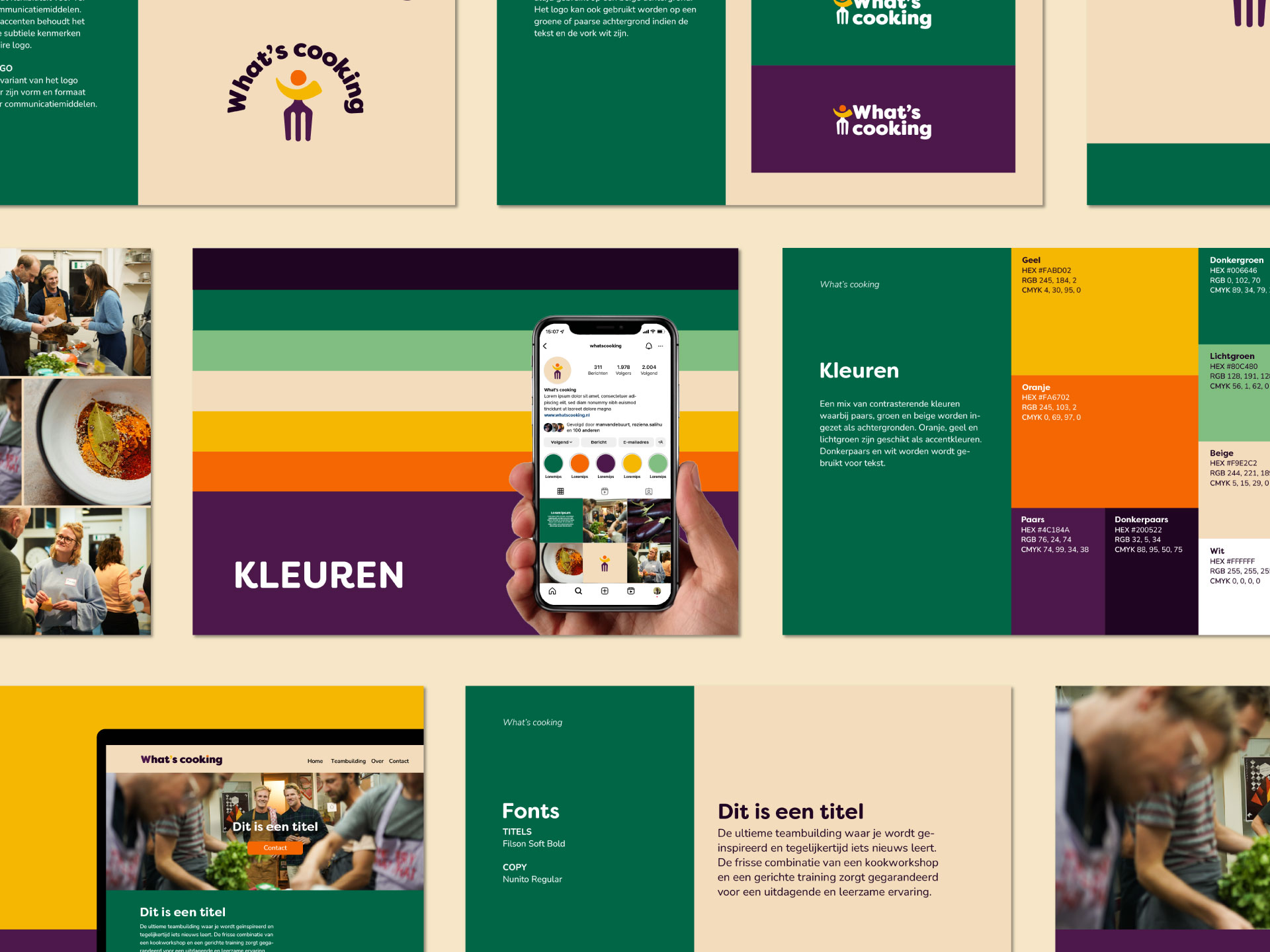
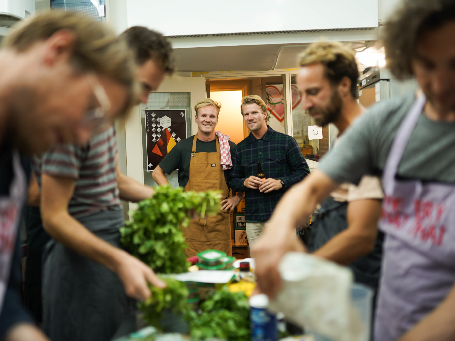
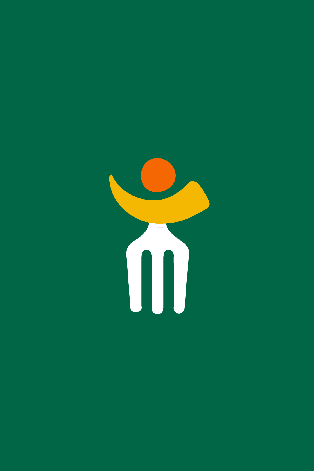
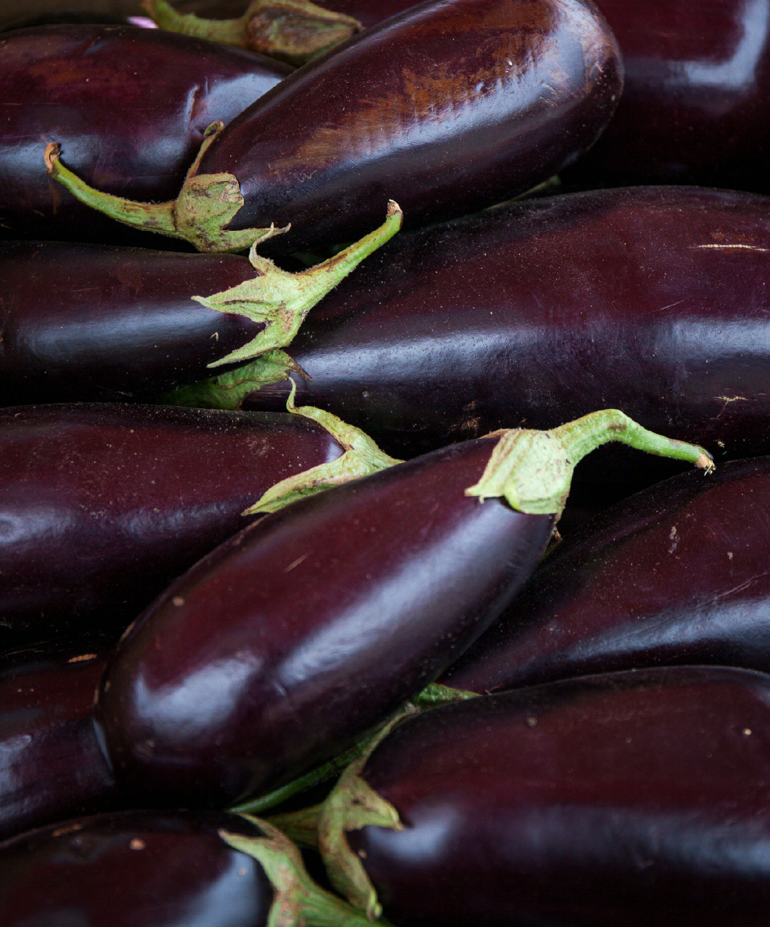
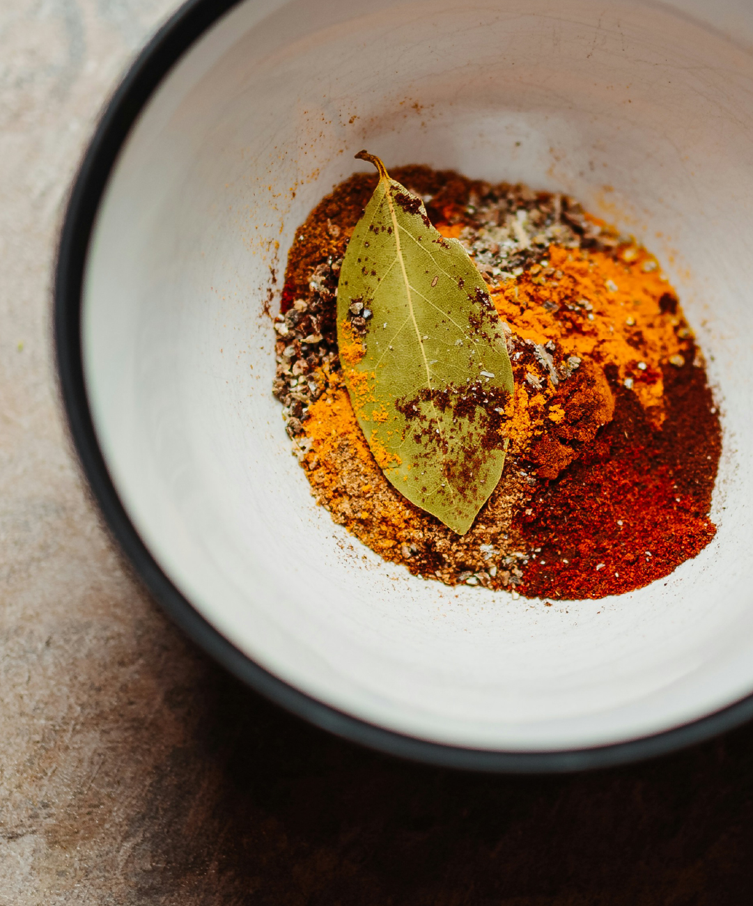
For this project I got to work with Daan and Gopal, two brothers who make the most fun out of teambuilding. ‘What’s cooking’ combines a professional training with a vedic cooking class, which makes their teambuilding event one of a kind. Researching the brand with Daan and Gopal was a lot of fun and it gave me all the inspiration I needed to create their visual identity.


by Gylian
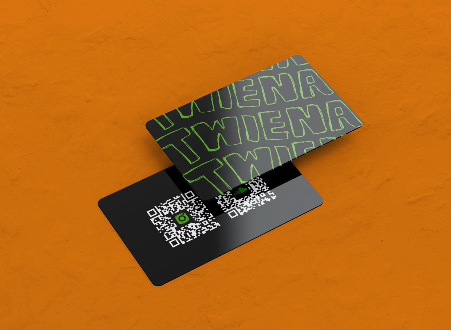
A DJ that supplies her audience with high energy vibes askes for a groovy business card. A card printed on plastic resin just like all the other important cards in your wallet, because Twiena is a DJ you can’t forget.
by Gylian
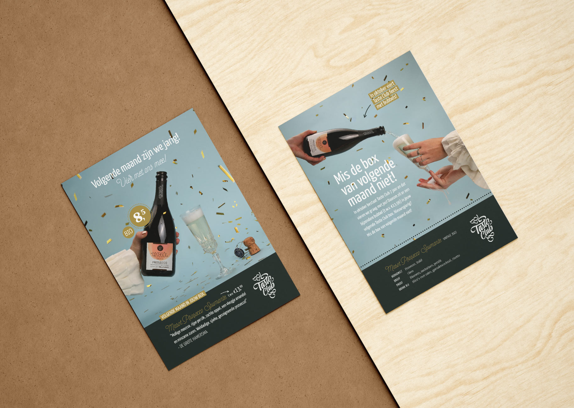
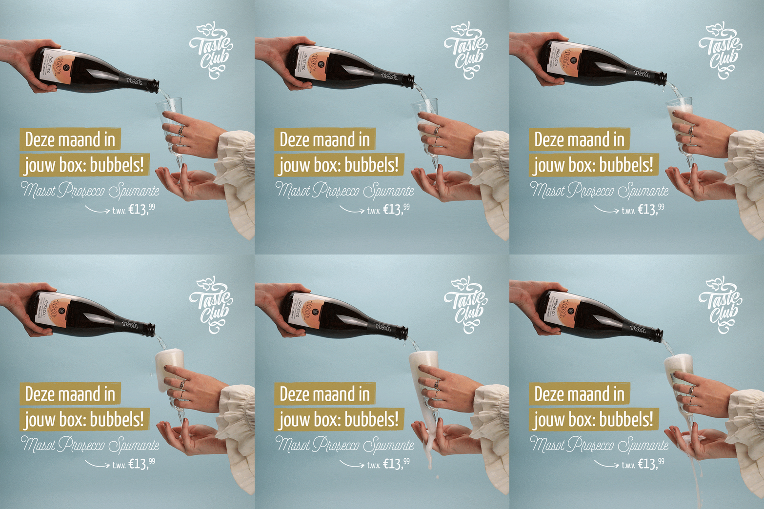
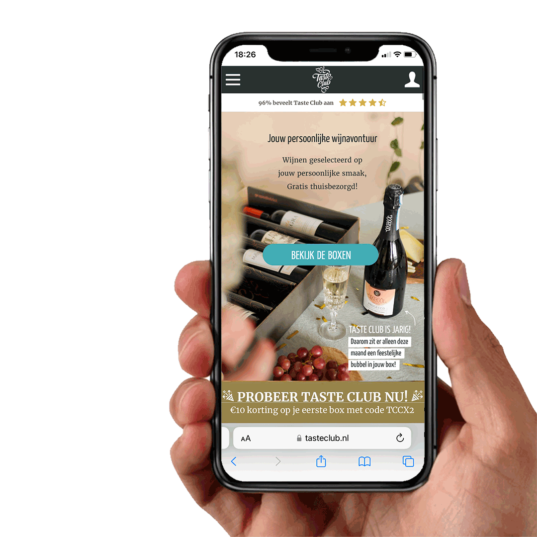
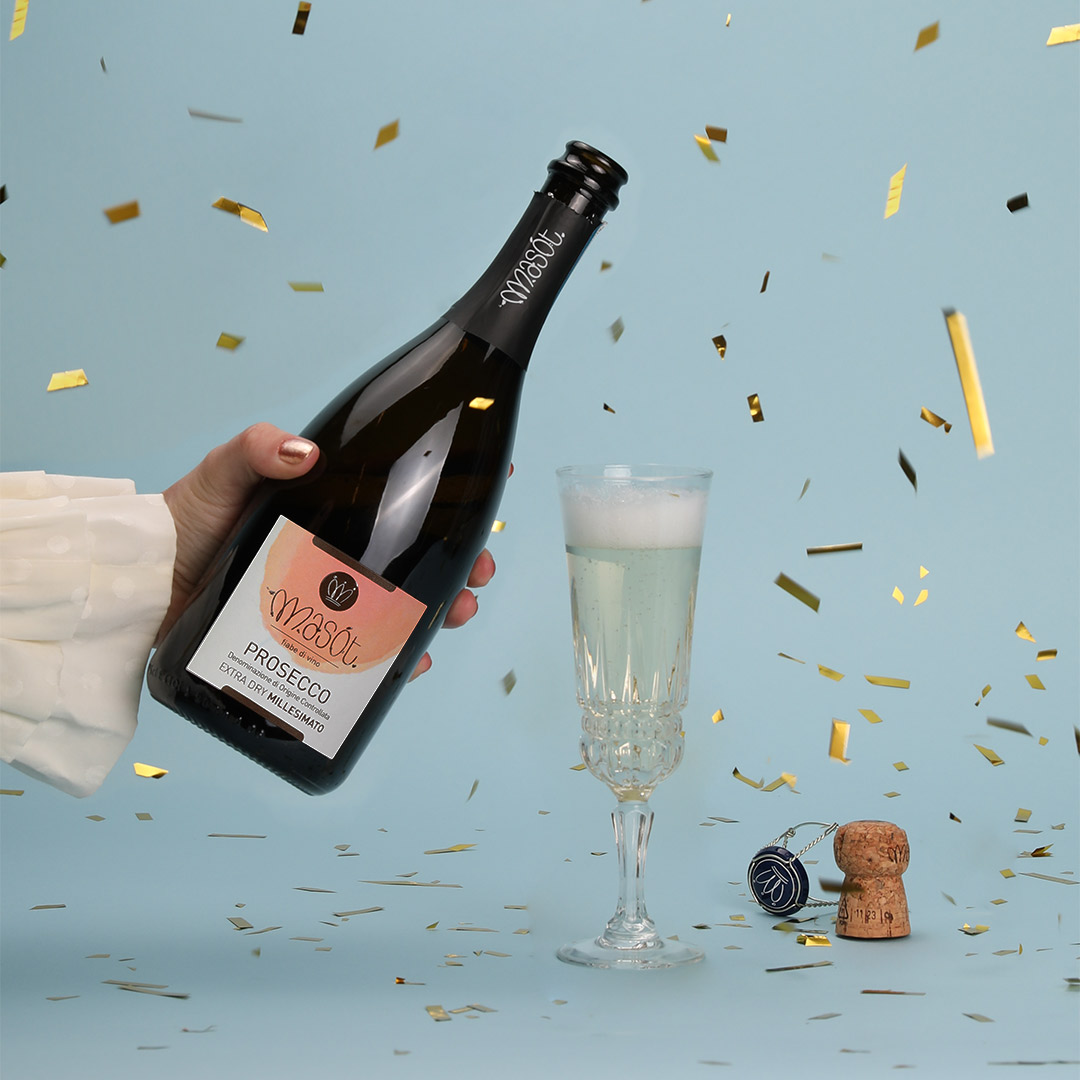
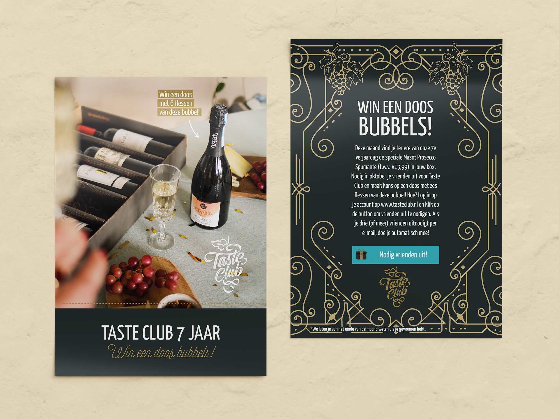
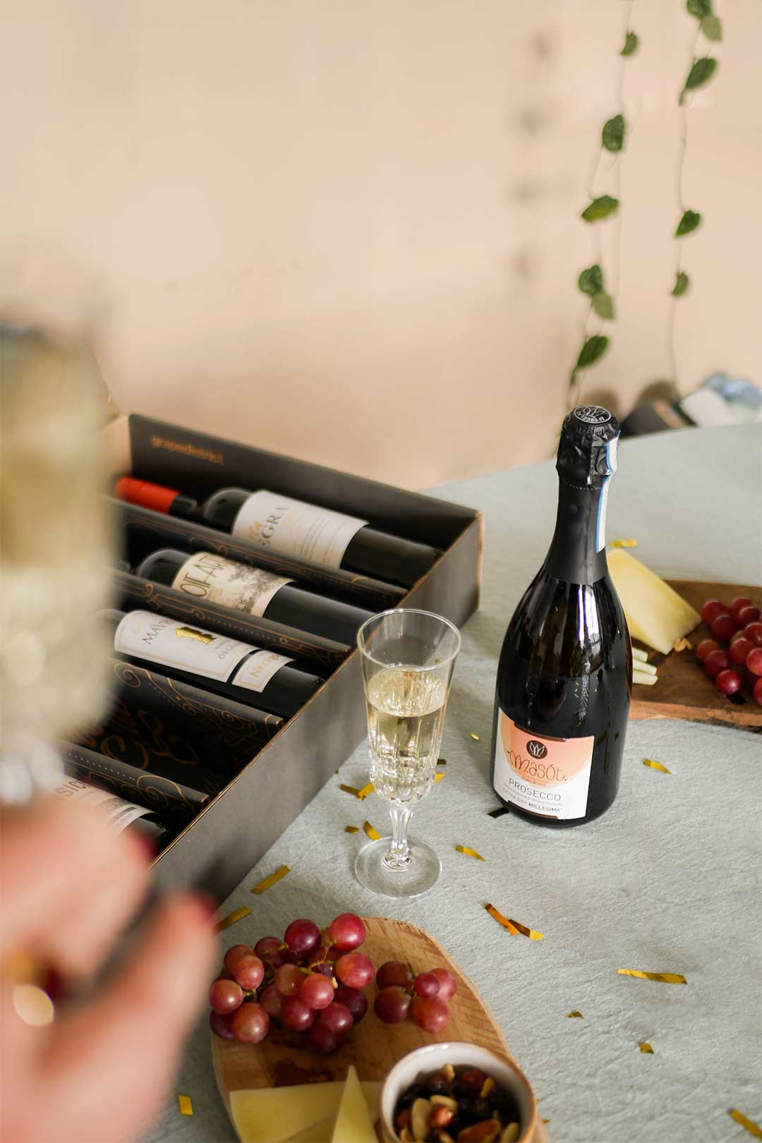
Like we say often say in Dutch “wie jarig is, trakteert”, Taste Club (a wine subscription) surprised their members with a very tasty present for their 7th birthday: Prosecco. This asked for some festive content that could be used for the website, newsletters, social media and flyers. A very fun project from creating the content in the studio to designing all the online and offline assets.
by Gylian
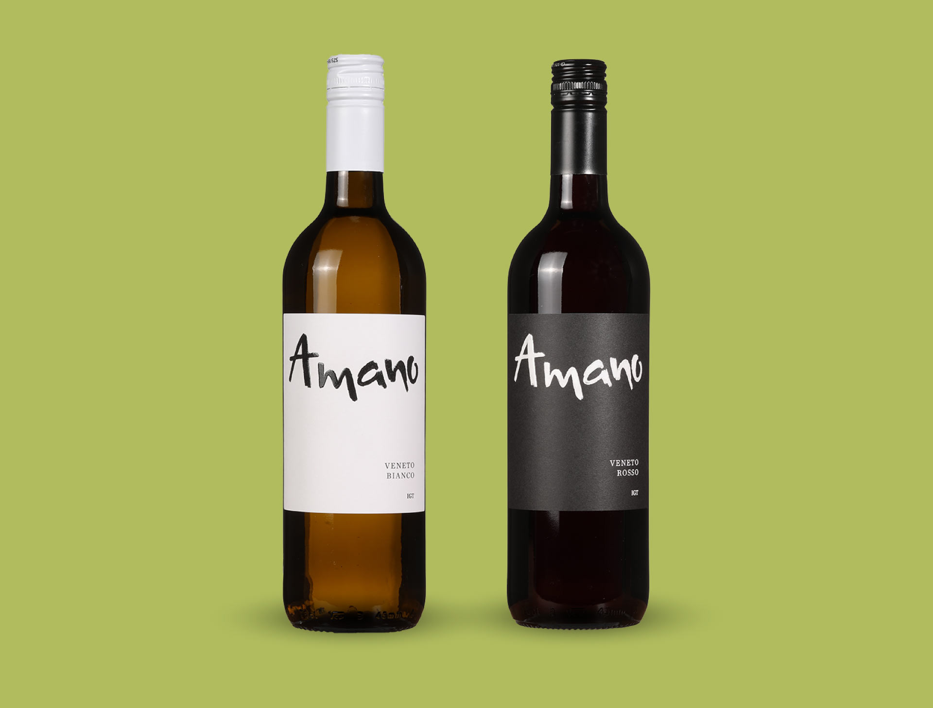
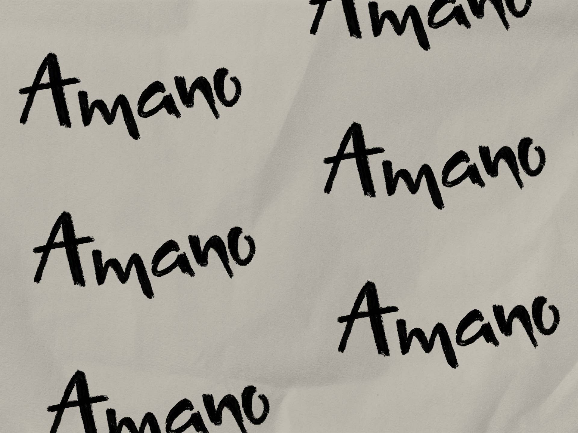
Amano means ‘crafted by hand’ in Italian. That’s why these wines asked for a clean label, but with that handcrafted feeling. After a lot of sketching, I can say I’m very happy with the end result.


Tessa van Beelen
Borgerstraat 149D
1053PG Amsterdam
tessa@studiosetta.com