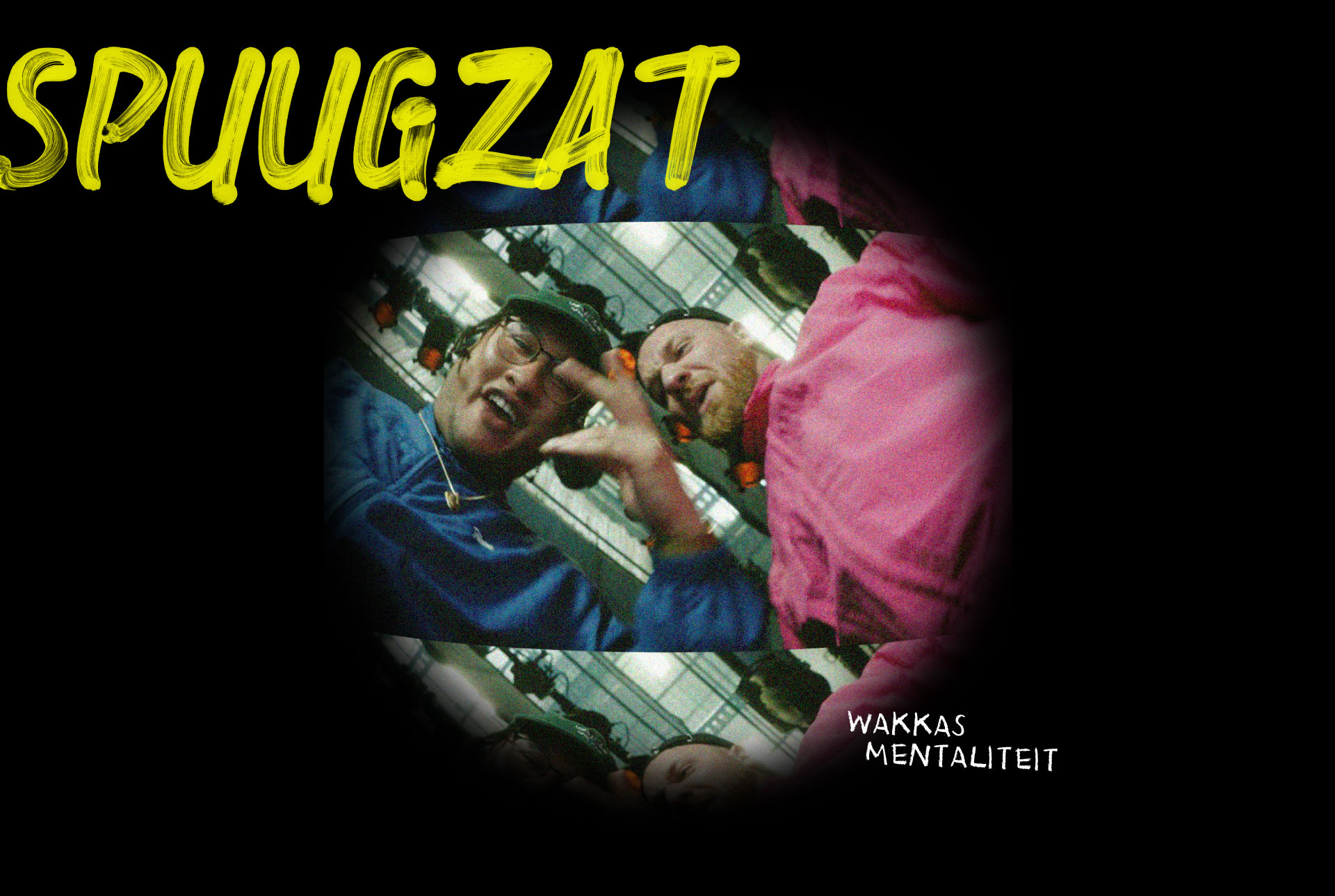
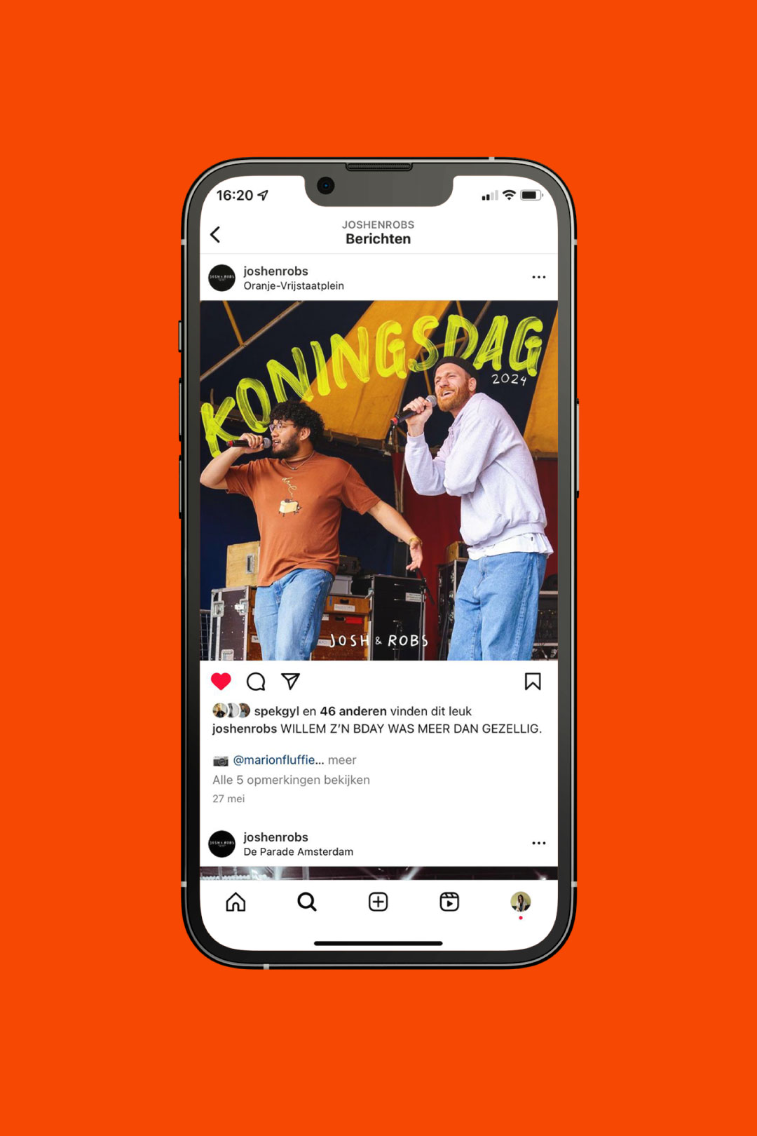
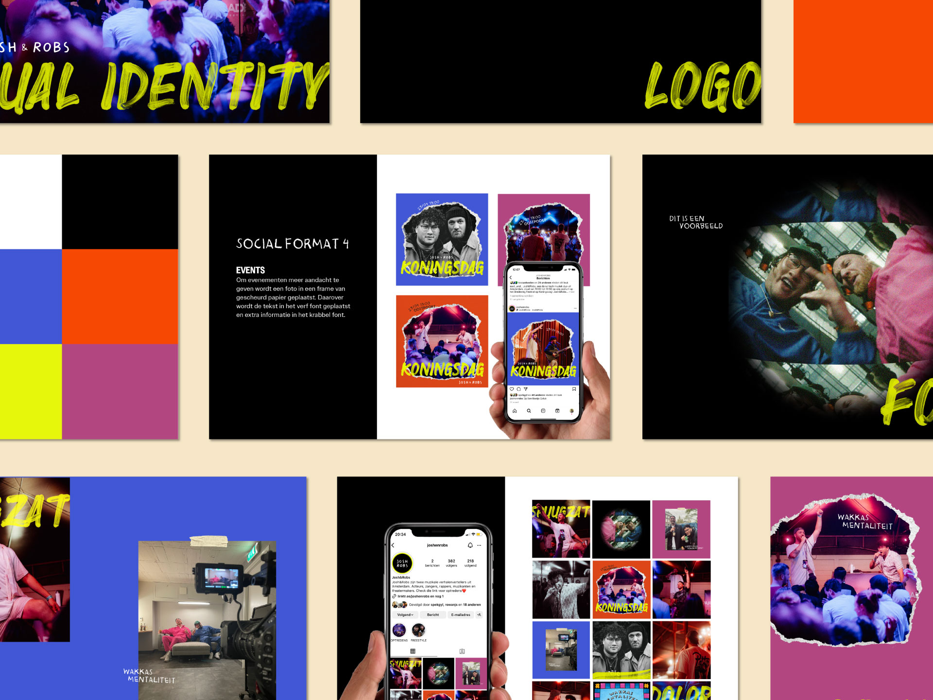
Josh & Robs are two friends who tell stories through music in all genres. They are here to motivate people, make them laugh and throw a party where everyone can join in. They asked me to help them with their social media strategy. I helped them figure out their style and created a visual identity including multiple social media formats to make posting on Instagram easier and more fun!
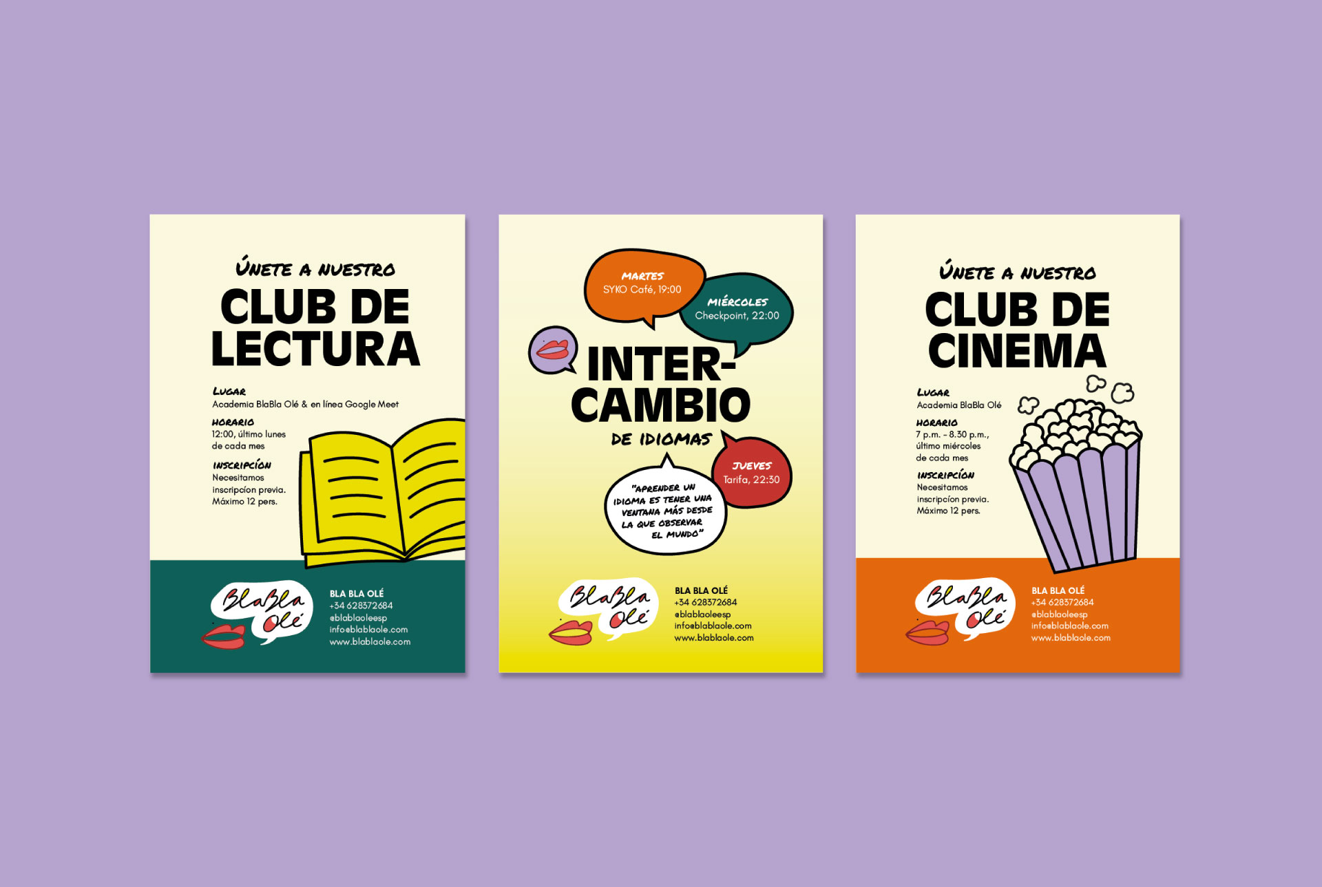
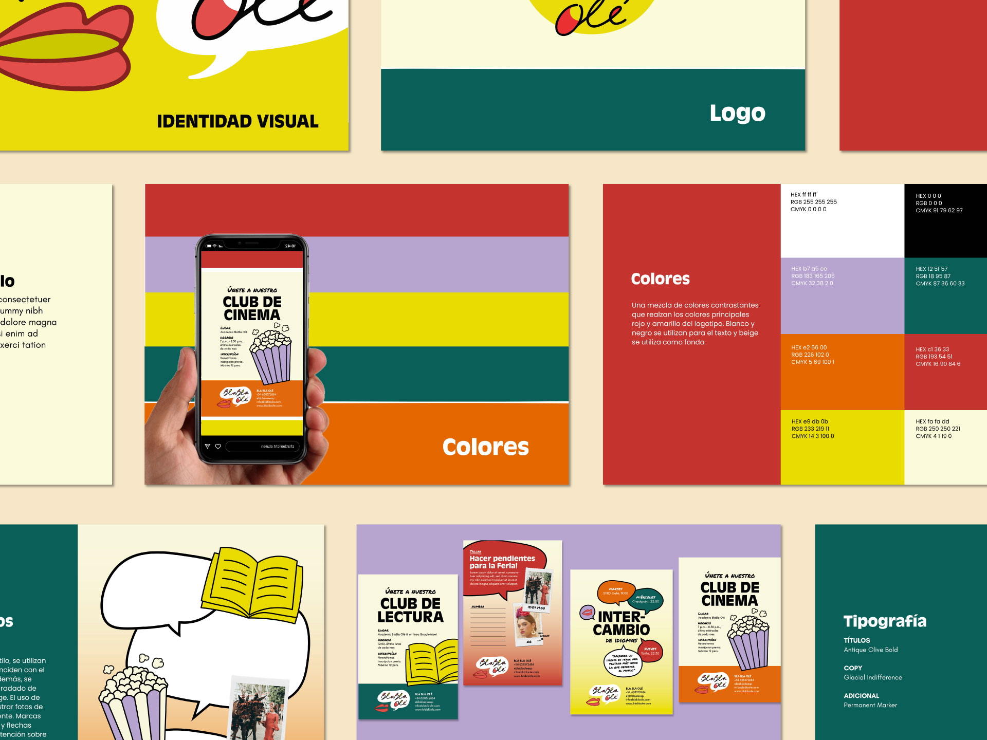
BlaBla Olé is a Spanish language school in Sevilla where you feel welcome from the first moment you arrive there. I got to experience it myself and felt so comfortable during Maria’s fun and professional classes. While growing fast I got to help her by creating a visual identity that matched her already existing logo. A challenging but fun project!
Gopi Gopi brings the Vedic kitchen to life with a modern twist. This cuisine from ancient India is not only very tasty and pure, but also completely vegetarian. Bold colors and playful illustrations capture Gopi Gopi’s energy, showing that healthy, sustainable eating can be fun and exciting.
For this project I got to work with Sunrise Studio, a creative production company that uses media and storytelling to inspire positive change. They help organizations with a social mission share their message in a way that is both impactful and approachable. With a young and ambitious team,they manage to stay approachable while consistently delivering impactful, high-end results.
In developing their brand identity, I aimed to express the way Sunrise Studio combines social impact with creativity and movement. The outcome is an identity that feels dynamic and approachable, while showing the professionalism and quality they stand for.
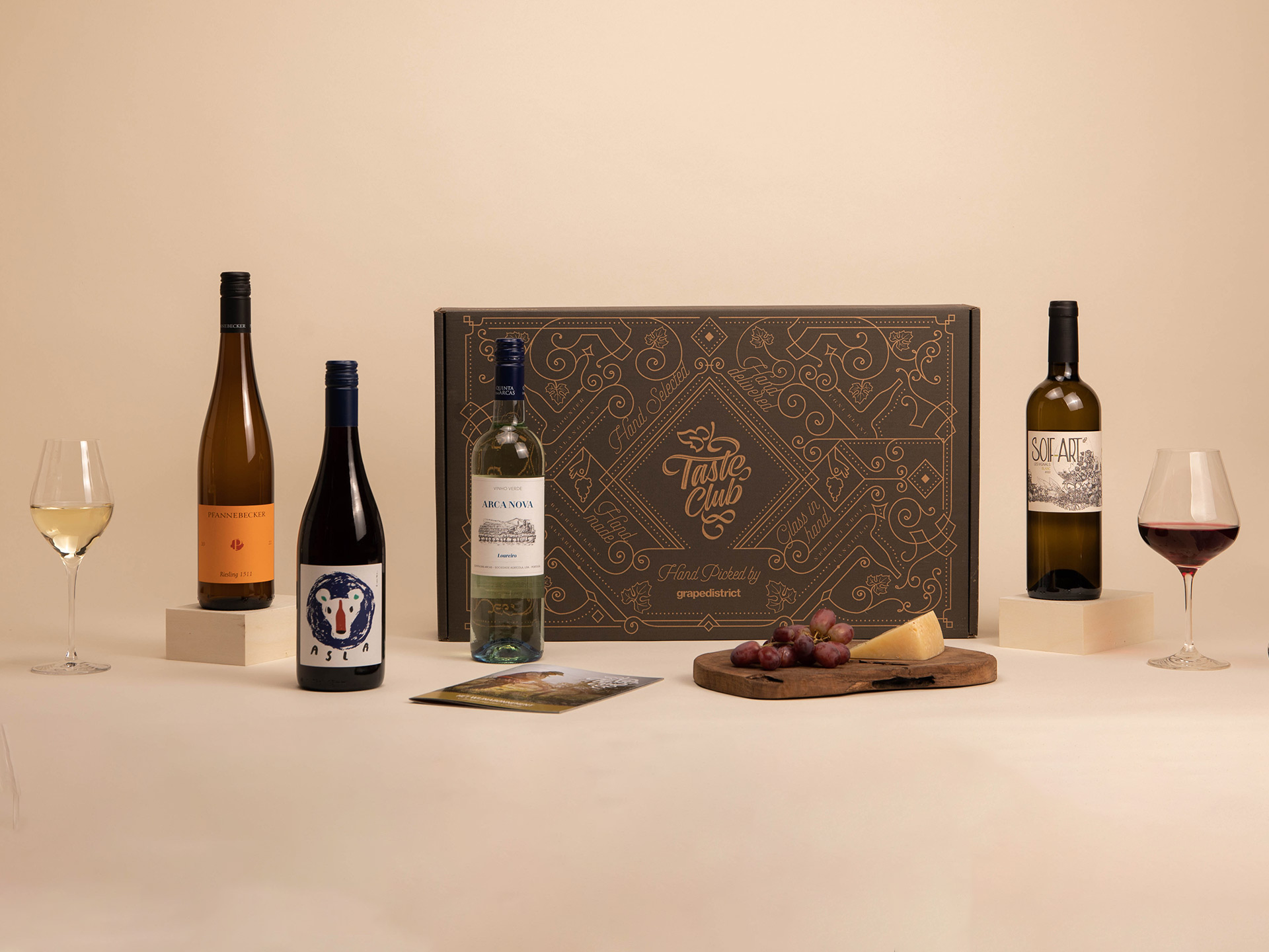
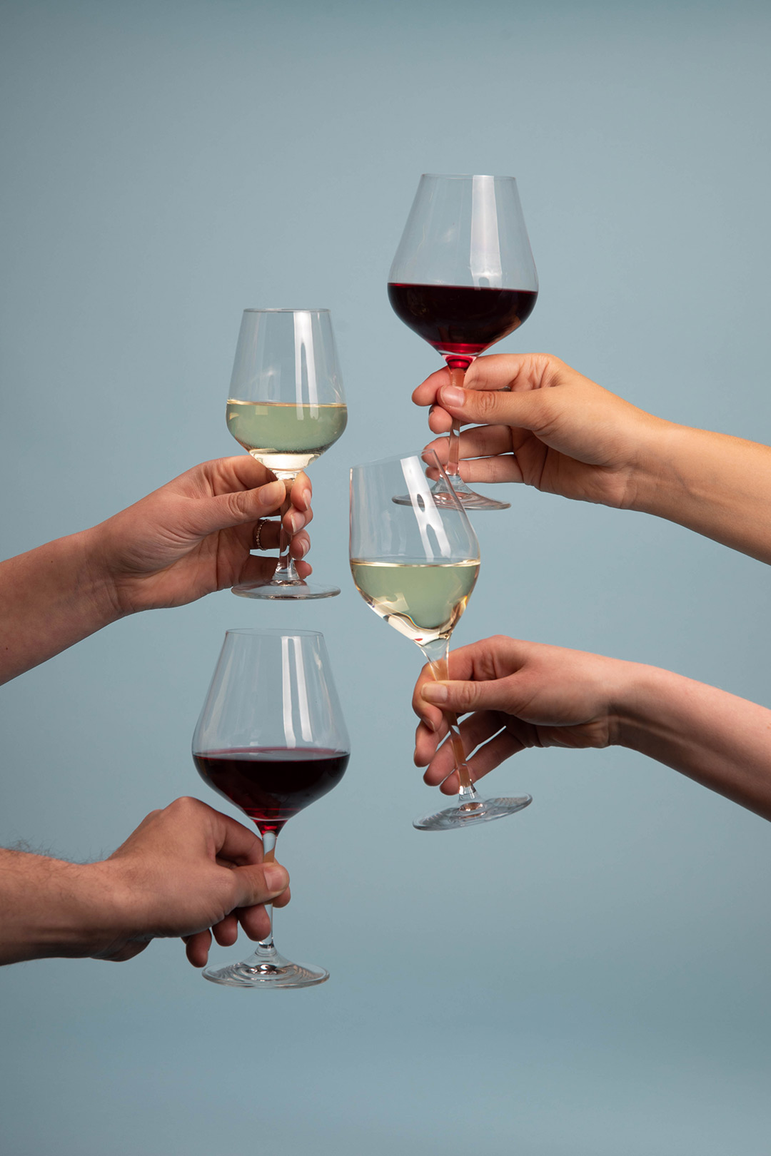
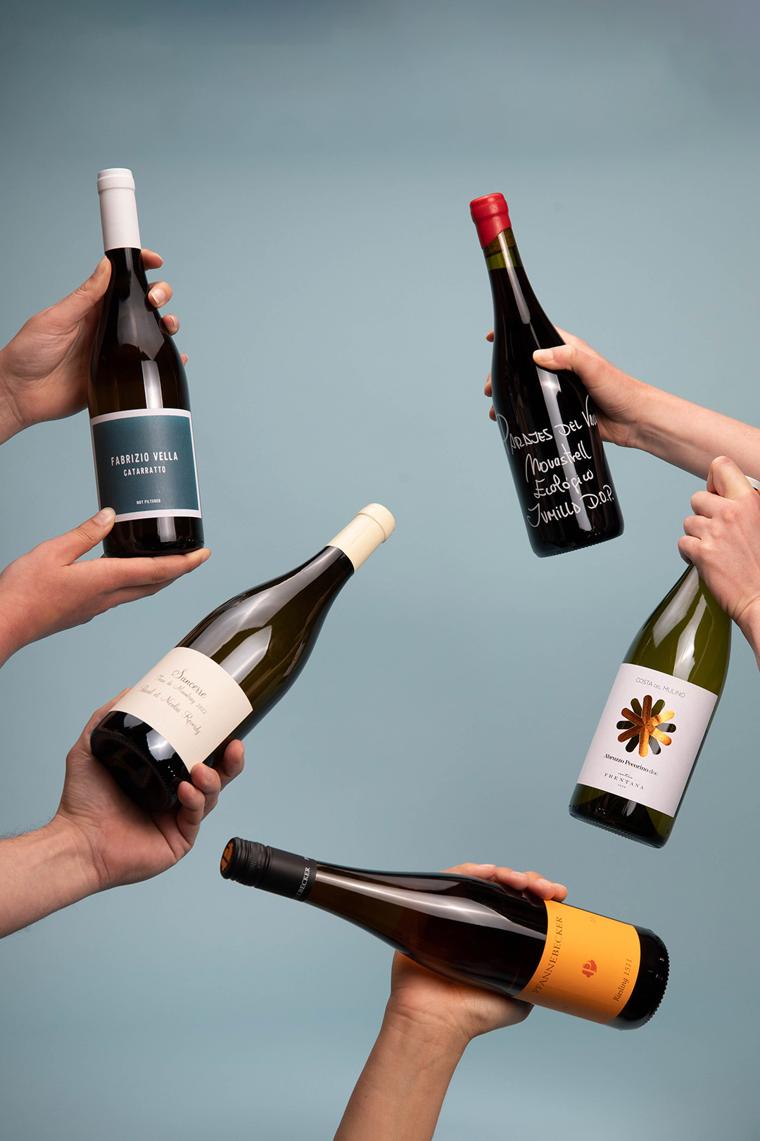
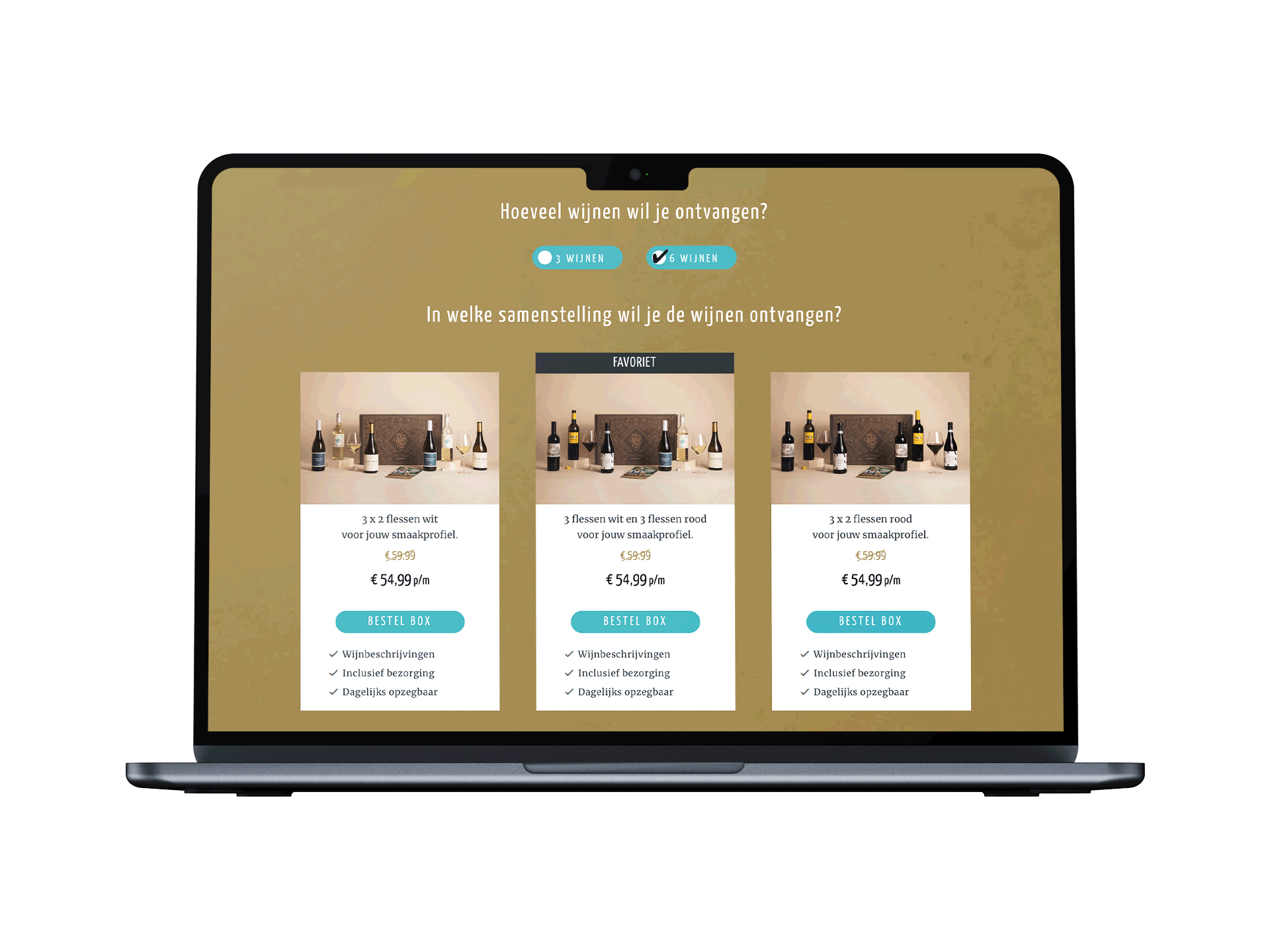
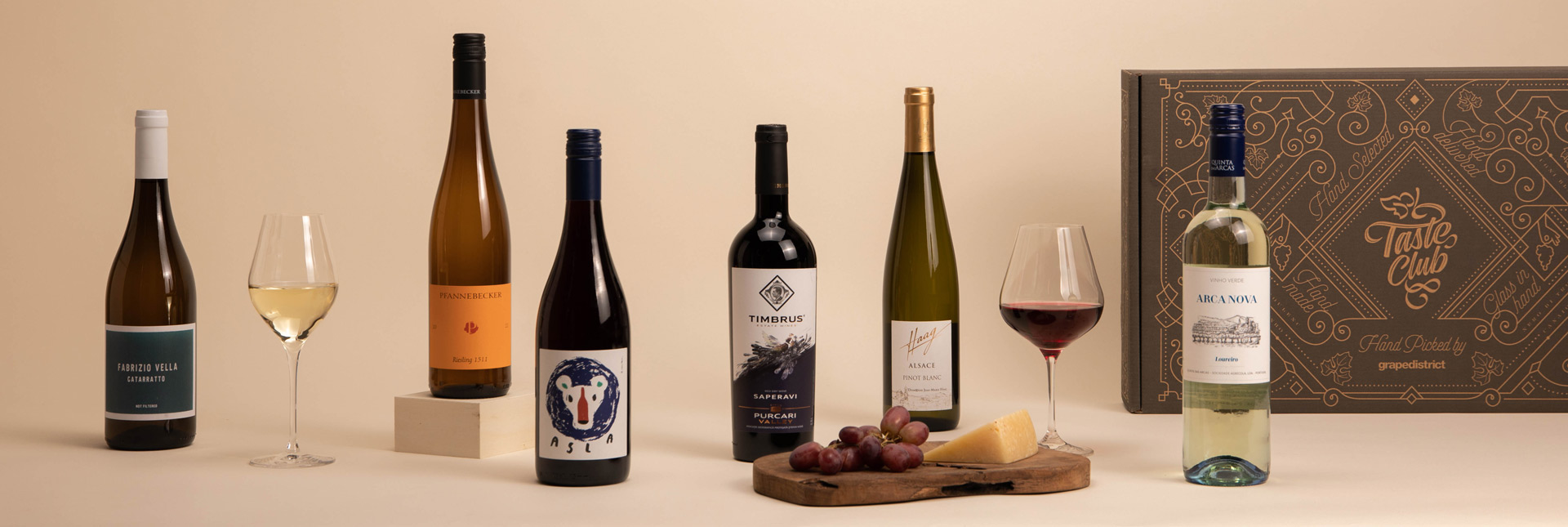
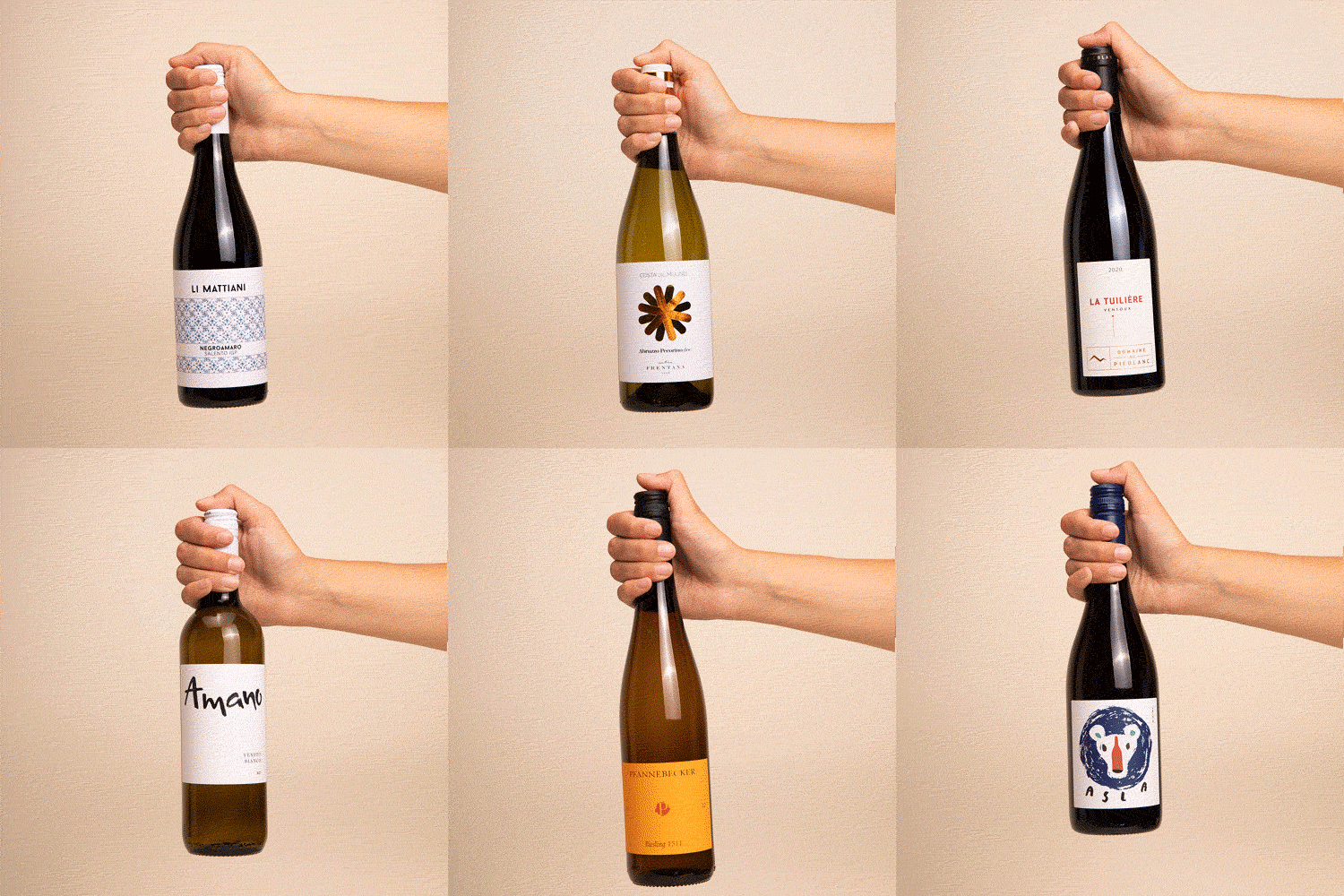
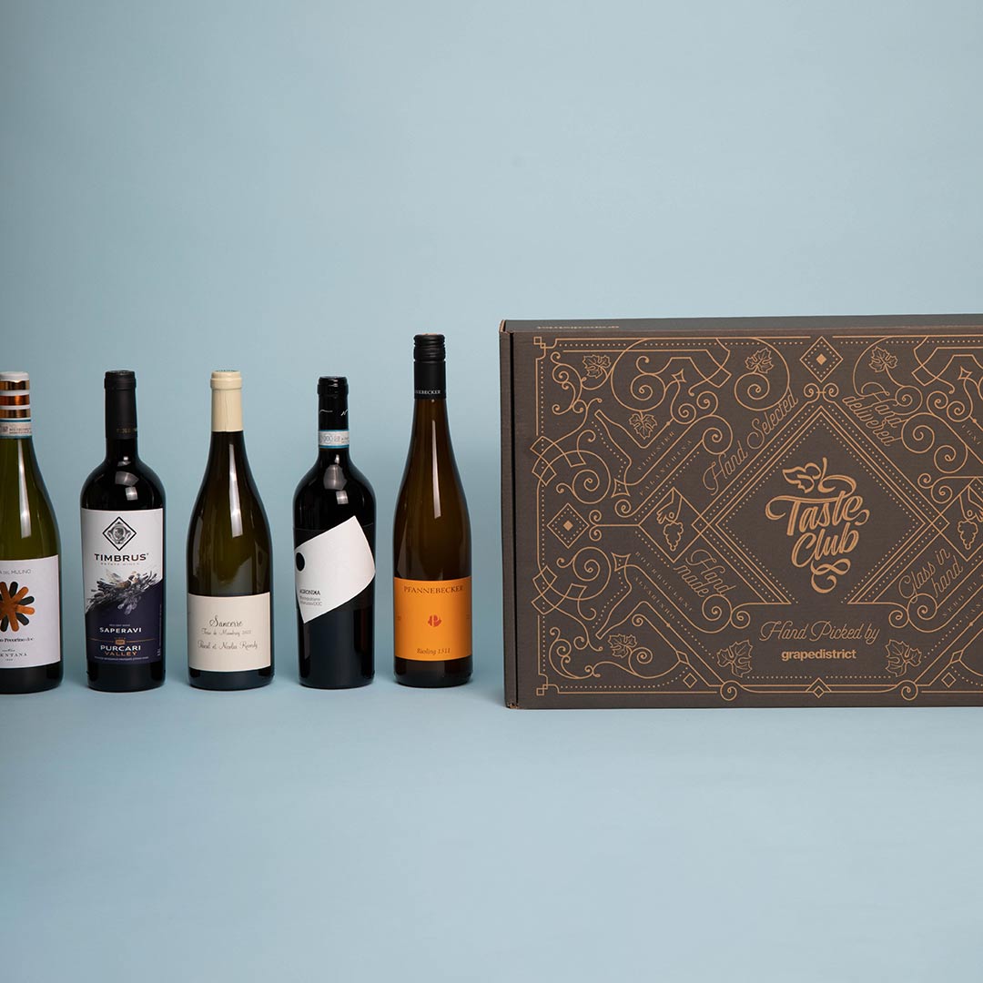
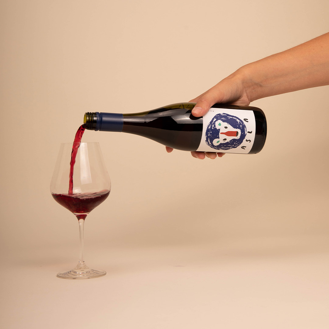
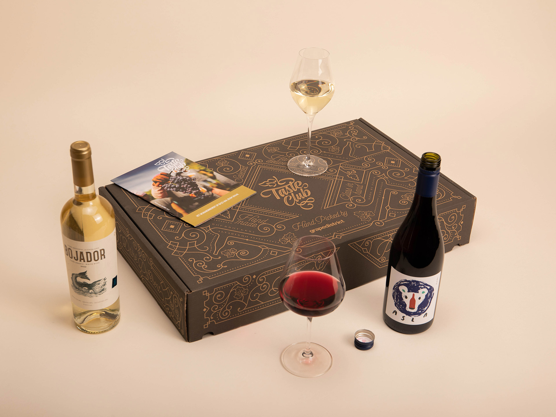
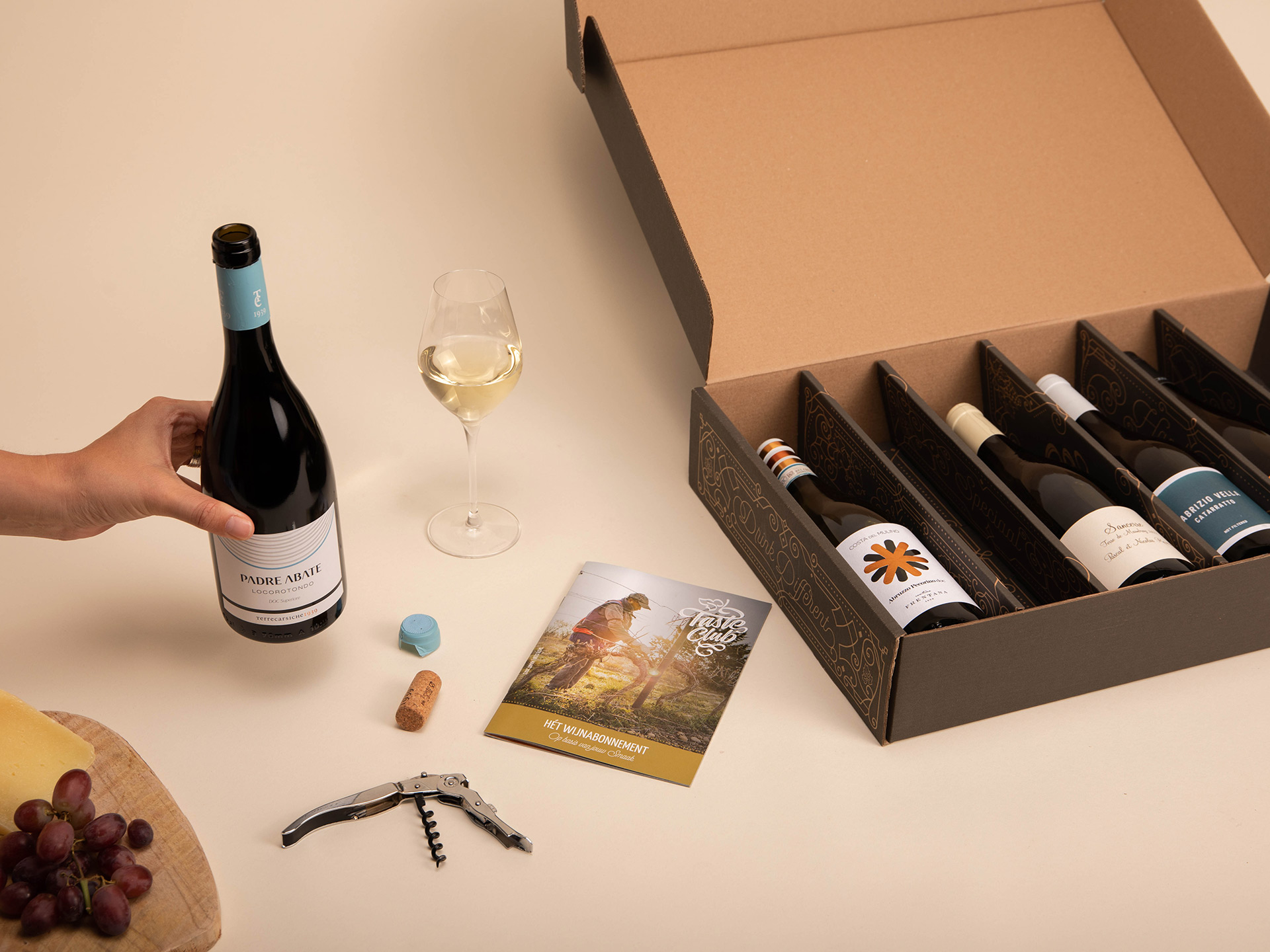
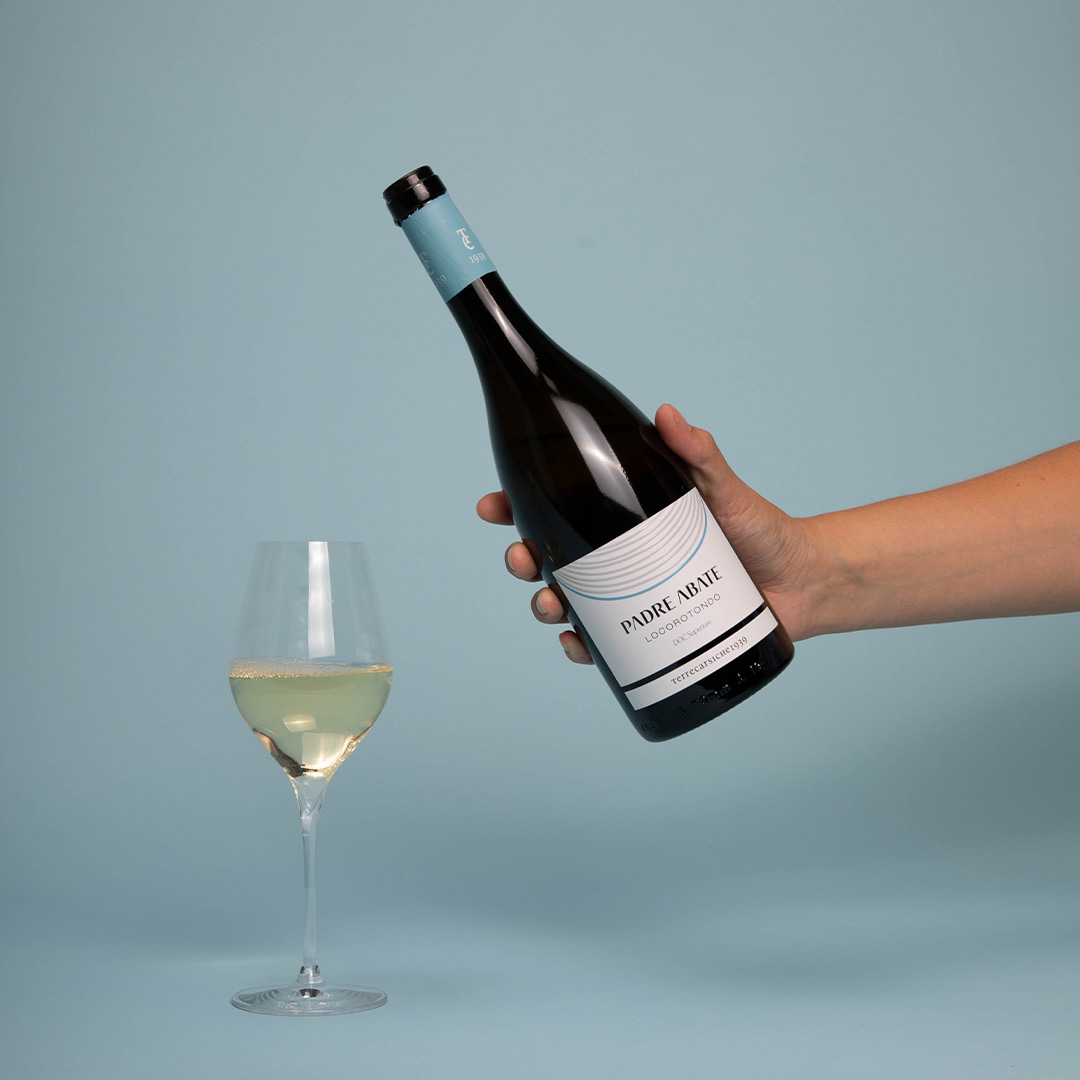
After brainstorming with the Taste Club team, we decided they needed more clear pictures of their product: a wine subscription that surprises their members each month with a box full of unique wines. My role in this project was to think of all the pictures we need, make sketches and decide how we were going to create this content. A very cool project, because I got to work with Frank, a photographer who taught me about studio photography. Together we created these pictures and I got to work with them in my designs for the website and social media posts.
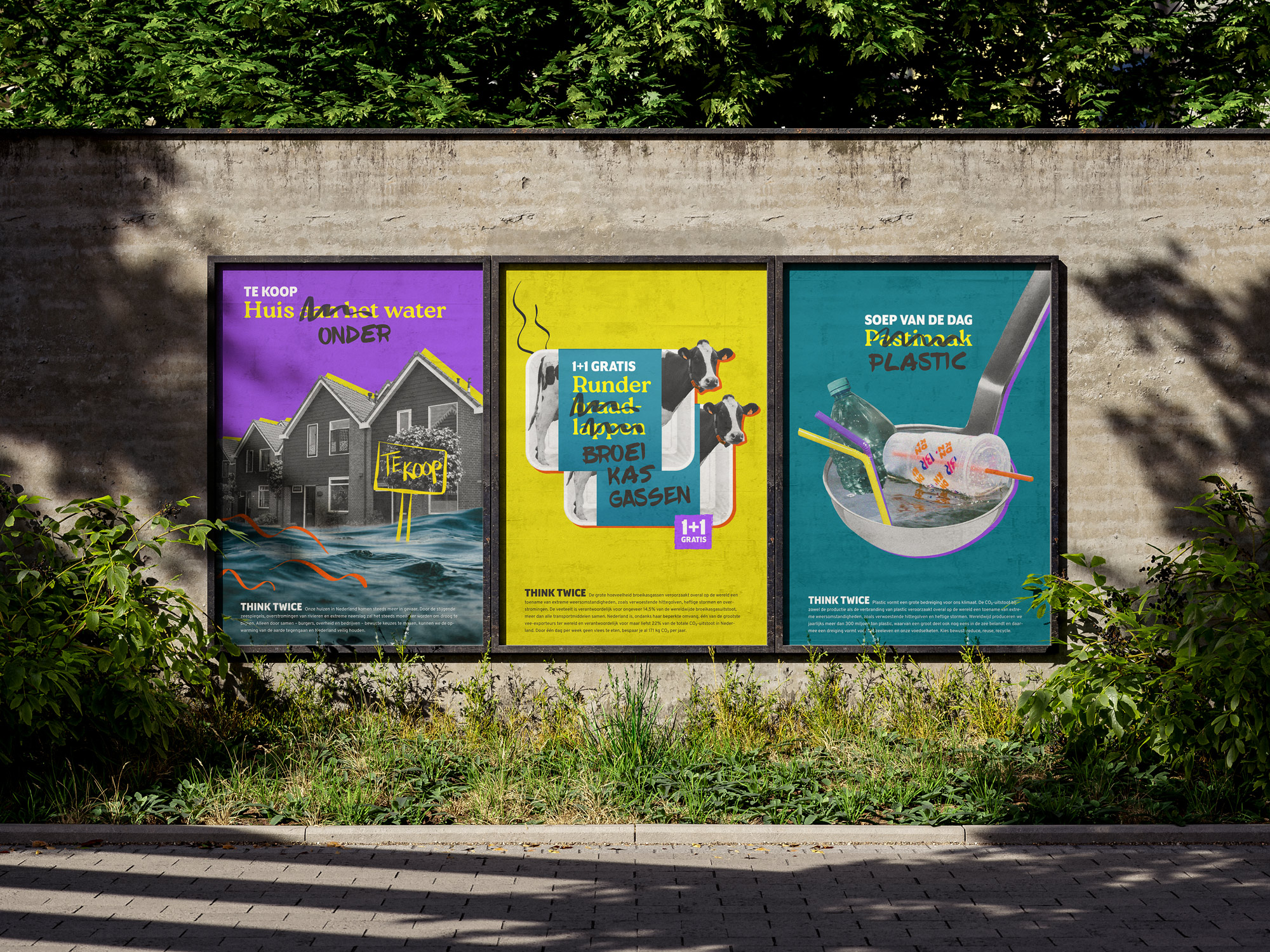
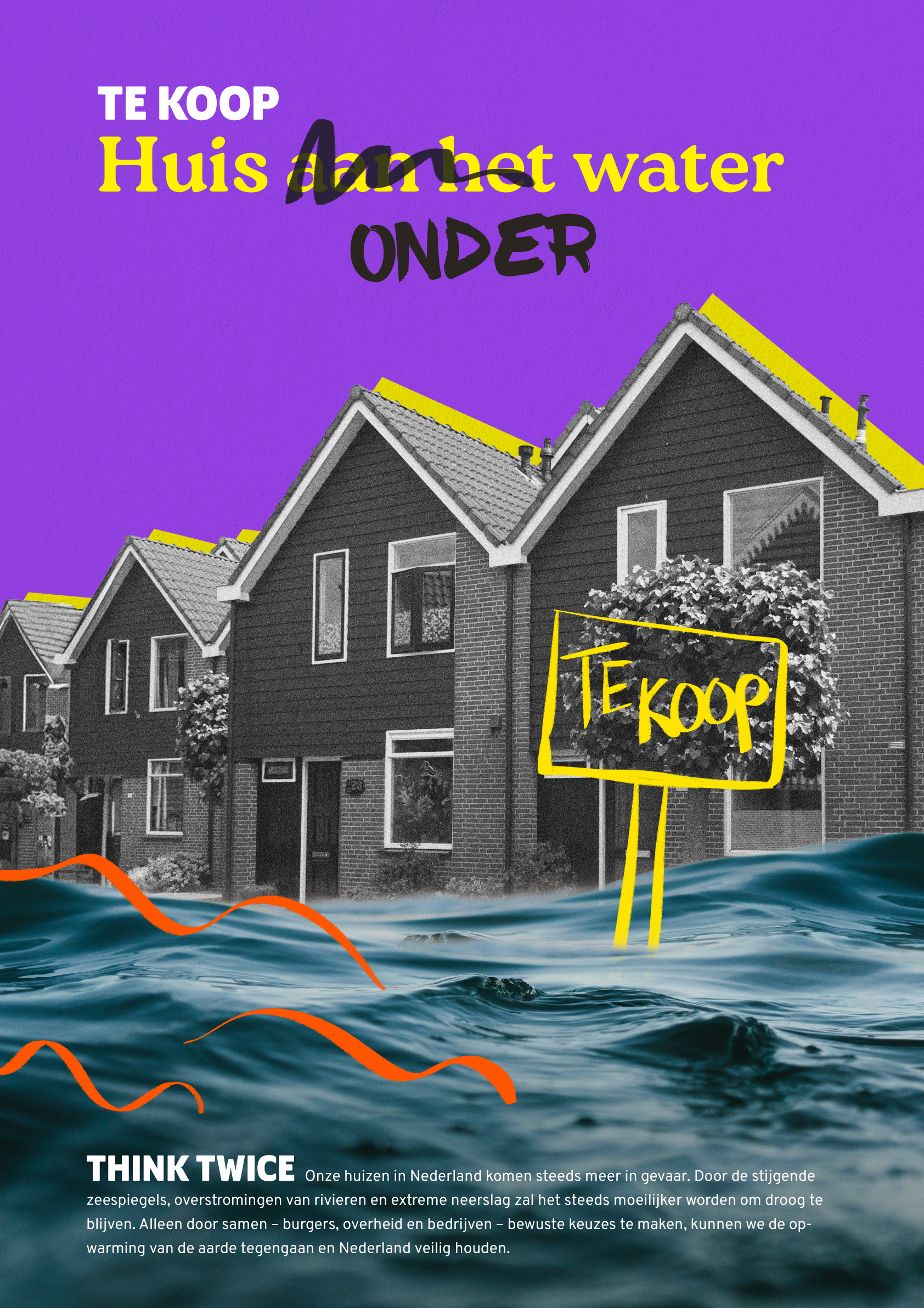
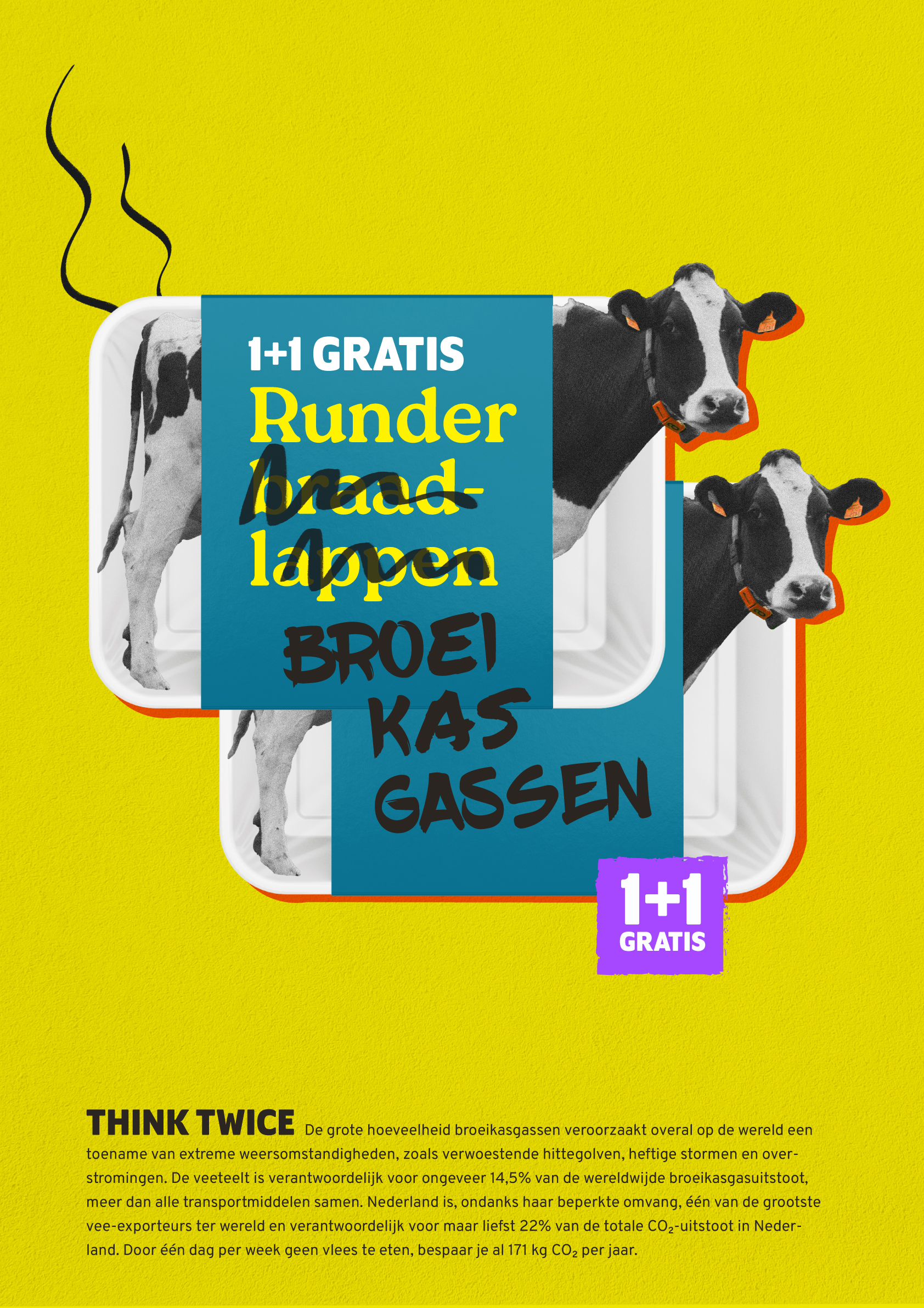
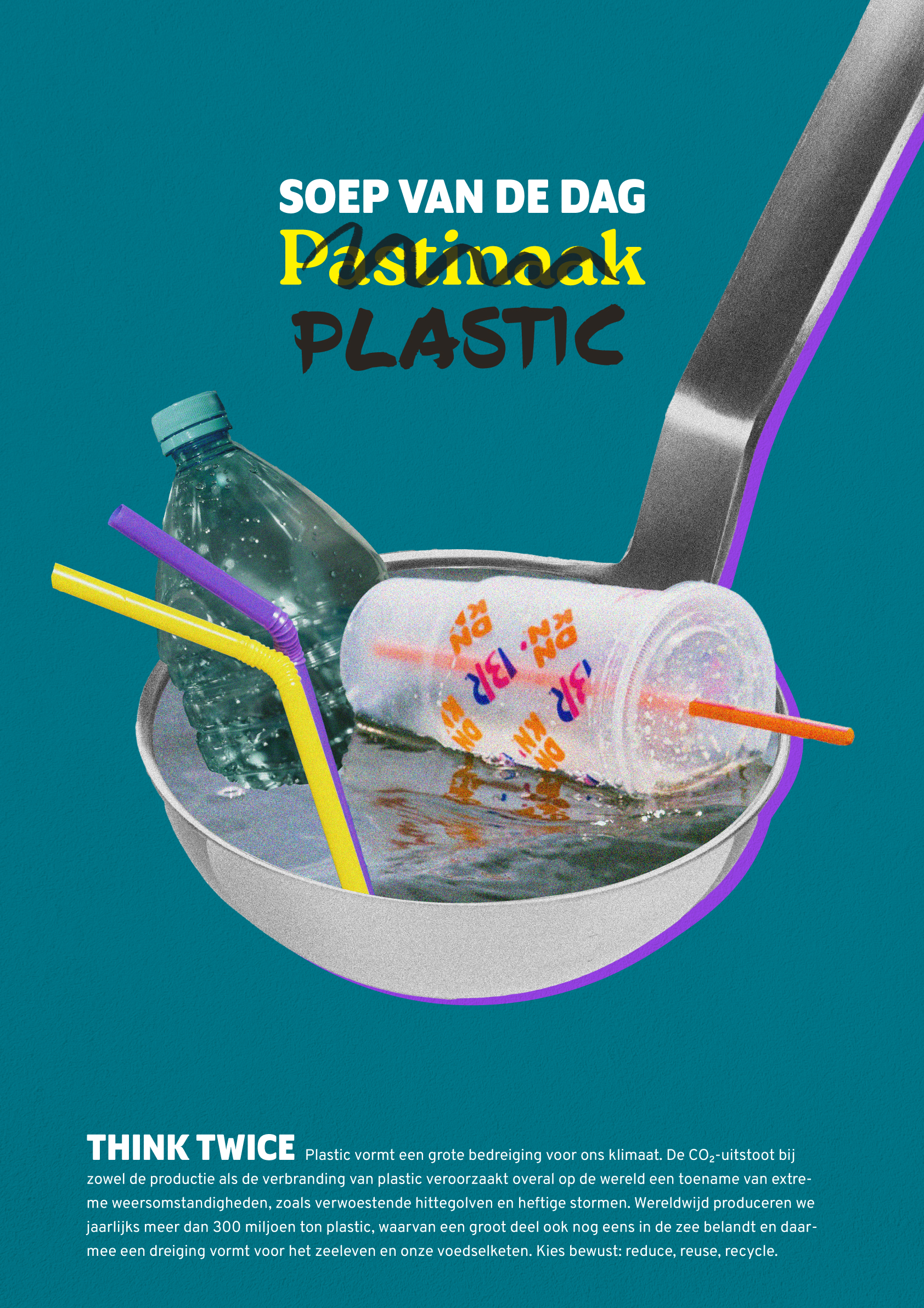
Posters for the Planet is a design competition and is the core of a larger media campaign about the climate. While 80 percent of people in the Netherlands are concerned about rising temperatures and decreasing biodiversity, they find it difficult to translate this concern into meaningful contributions to a better environment. Posters for the Planet aims to bridge the gap between good intentions and real change.
In my submission I wanted to highlight the issue of excessive production and consumption with a playful nod. I want to emphasize that only by making conscious choices together – citizens, companies, but most importantly: the government – we can combat global warming and protect our planet for the future.